
Most of the SME companies we talked to already have a business intelligence tool. It came with their ERP, or someone bought Power BI a few years ago, or a consultant built a set of dashboards that looked good in the meeting where they were presented. The tool is rarely the problem. When a controller tells us the reporting does not work, they almost never mean the charts are ugly. They mean they do not trust the numbers, or the dashboard sits unopened because getting it to say something true costs more effort than doing the sums by hand.
This piece is about why that happens, and why the fix is a layer most people do not think to look at: the data underneath the dashboard, the part that joins your systems together and agrees on what the numbers mean.
The symptom
One manufacturer we spoke to had the reporting module of their ERP switched on the whole time and had actually never used it. The underlying data was too unreliable to make the reports worth reading. They had BI available to them for years. What they did not have was data anyone in the building believed.
What makes this hard to see from the inside is that the people running these companies do not think they have a data problem. KPMG's 2026 Global Tech Report for industrial manufacturing asked 258 technology leaders across 22 countries two questions in the same survey: 83% said they were building strong data foundations for AI, and 76% named unreliable data as a top AI risk. The same respondents, a few questions apart. Confidence in the data layer runs well ahead of the state of it, so the problem tends to surface when somebody needs a number, long after the budget was set.
The pattern is consistent enough that we now expect it. A capable BI tool sits on an ERP, sometimes two or three after a few acquisitions, plus a warehouse system, a shopfloor system and the usual spreadsheets. The dashboards exist and go unopened, because everyone knows the numbers do not quite reconcile, and a number you have to make a caveat for is worse than no number at all.
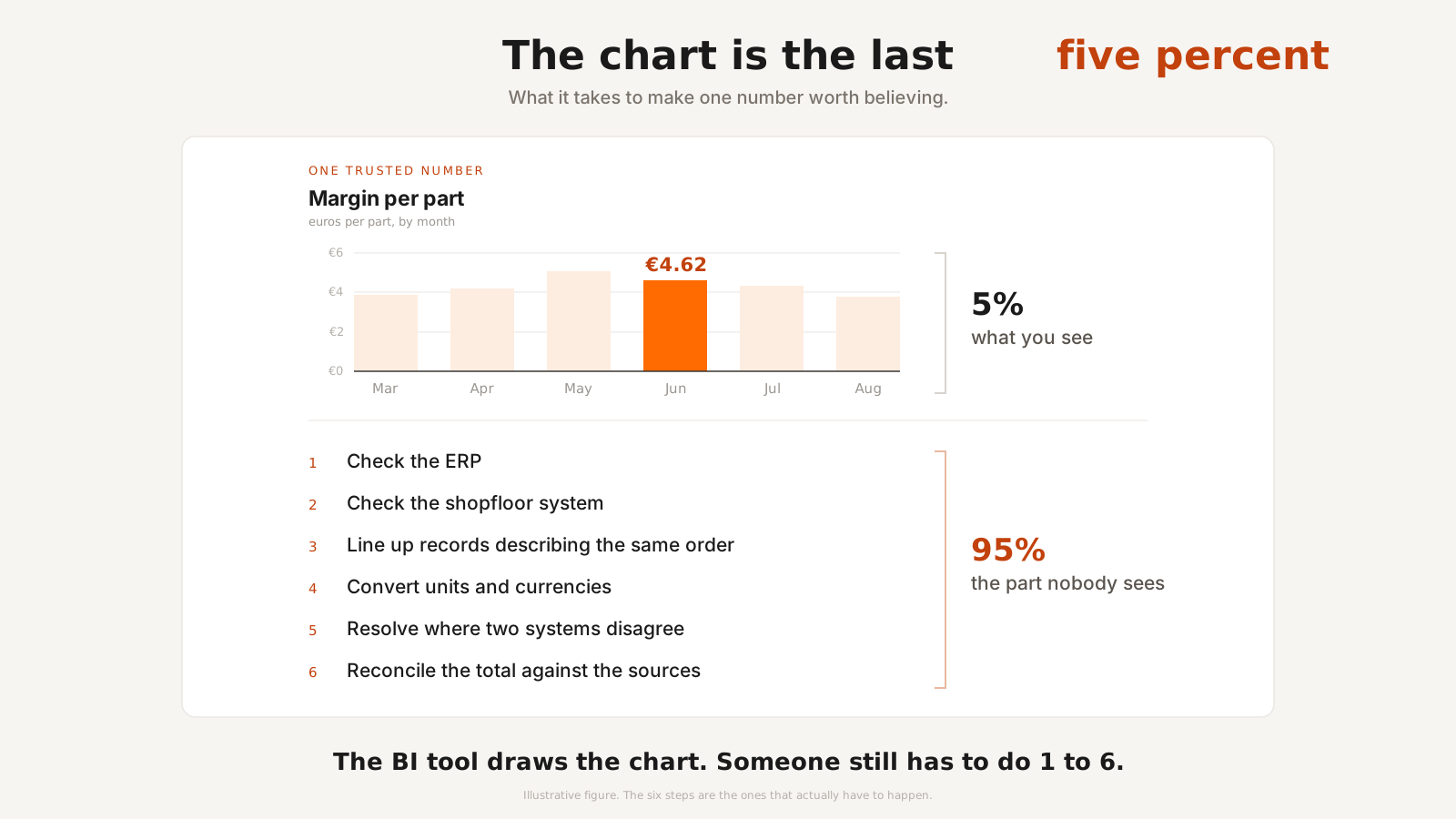
The chart is the last five percent
There is a useful way to see the split. When a report finally works, the visible part on the screen is a small fraction of the work that made it trustworthy. An ERP expert we spoke to who has built a lot of these put it at roughly 95% data processing and 5% visualization, and that matches what we see.
None of that processing shows up on the dashboard, and it is the real reason the dashboard is able to be trusted. A BI tool assumes the work is already done. It is a presentation layer, and it presents whatever it is given, including data that is wrong in ways the chart cannot reveal. And trust once lost might never be recovered, resulting in a pile of unused BI dashboards.
Why "just add a dashboard" does not fix it
Three failures make reporting untrustworthy, and every one of them lives upstream of the chart where a BI tool cannot reach.
- There is no shared key. Two systems hold data about the same order, so the join has to be reconstructed from fields that were never meant to identify anything. Get it wrong and the report double-counts or quietly drops rows, and it looks correct either way. That last part is what makes a bad join dangerous rather than merely annoying.
- The same word means different things. We have seen a machine stopping recorded with 15 category codes in one plant and 87 in another, so "downtime" is not one number until someone decides how the schemes map. Finance hits the same wall: "Revenue" in one ledger and "Umsatzerlöse" in another are not automatically the same line, and a consolidated report that assumes they are is wrong before it is drawn.
- Nobody's job is to fix either of those. These companies have a controller who is good with Excel, or one engineer who writes SQL because no one else will, and no documented schema, so the knowledge of how the systems fit together lives in a few people's heads.
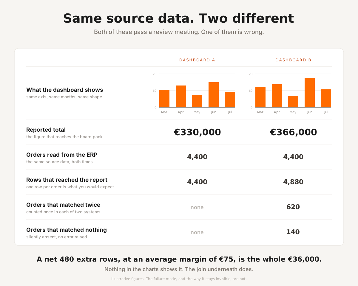
The same report, drawn from two different joins. One of them is wrong by 11%, and the chart is not the place you will find out which.
A BI tool hands that controller a canvas and assumes they are already holding clean, joined, well-understood data to put on it. That assumption is the bottleneck.
Tracing a number back to its source
A BI tool shows you a figure. Once the data has crossed systems it cannot tell you where that figure came from, and that gap is why an untrusted dashboard gets re-checked by hand before anyone acts on it. The re-checking is the real cost: slow, done by the person whose time is worth the most, and repeated every month.
We know this one from the inside. Before Beetl existed, the three of us rebuilt the data platform behind a programmatic job ads product at an HR tech company of around 1,200 people. 6 data engineers ran a pipeline processing billions of events a day, and most of their capacity went into one loop: someone reported a number that looked wrong, and the team spent days establishing whether it was wrong or the metric was behaving exactly as designed, then days more backfilling it. The pipeline was not really the problem. Proving what the pipeline had done was the problem.
Closing that loop is what the rebuild was for, and it is why our platform is shaped the way it is. Data incidents fell by roughly 90% and about 70% of the team's engineering capacity went back into building. That company was never a Beetl customer and Beetl did not exist yet; these are figures we measured on a system we built and ran ourselves.
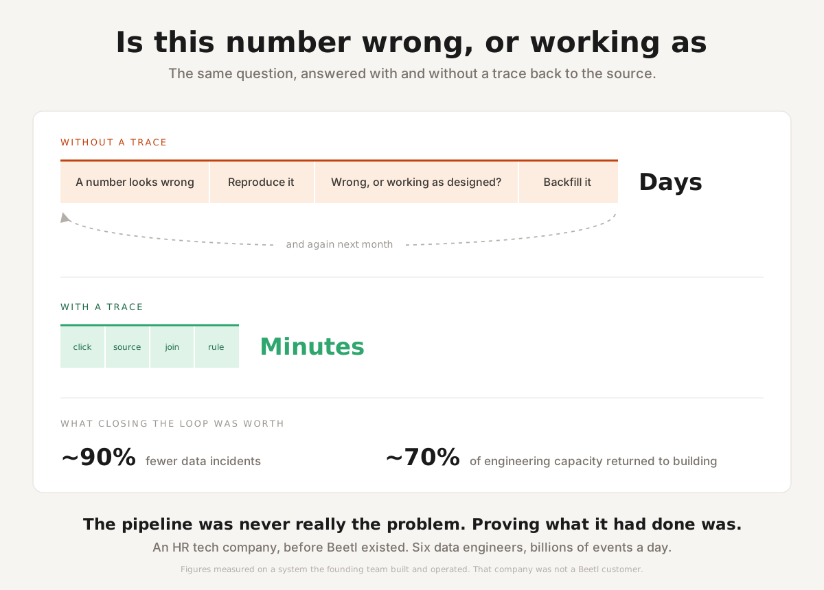
The loop that consumed most of six engineers' capacity, and the same question answered against a traced value.
So when our platform computes a value you can click it and follow it back to the source table, the join that combined the records, and the versioned rule that produced it. You find out whether the number is wrong or your intuition is, in minutes.
To be frank we still have 2 limitations with our Data Lineage feature:
- We can show how the tool arrived at a number. We cannot certify that the source system recorded the right thing in the first place, and nobody can make that guarantee truthfully.
- The trace is not cell-level. Once values combine inside a SQL computation, an aggregate cannot be pulled apart again into the rows that fed it. What we can always show is the inputs, the transformation, and the version of the rule that ran.
In practice that settles most arguments, because they are usually about which records were included and what a field was taken to mean rather than about the arithmetic.
The integration is the difficult part
Once the data is joined and its meaning agreed, the reports are comparatively easy. We do the join and the entity model once, and a margin view, a downtime view and a supplier view become an insight view over the same data rather than three separate projects. The hard and genuinely valuable part is the integration underneath. The math on top is ordinary, and a manufacturer who knows their own process will see through any product that pretends the arithmetic is the clever bit.
Michele argued the same point from the other side in why data-driven decisions are hard to make routine: data earns its keep only when it changes a decision, and rebuilding the integration for every new question is what stops that becoming routine.
There is a measurable version of this, and it comes with two caveats worth stating. MuleSoft's 2026 Connectivity Benchmark, run by Vanson Bourne in October and November 2025, puts 36% of IT time into designing, building and testing custom integrations: over a third of a team, spent on connections rather than on anything a customer sees. Salesforce owns MuleSoft and sells integration software. And the 1,050 IT leaders surveyed all work at organisations of 1,000 people or more, which is not who we build for. Read it as evidence that this problem scales rather than as a measurement of your own shop.
This is also why we describe what we do as programmable data integration rather than as another analytics tool. Reporting is one of the things the layer makes possible, and it sits on top of something that has to exist first.
What this means for what you are buying
If your dashboards are not trusted, more dashboards will not help, and neither will a better BI tool. The layer that needs fixing is the one below it. BARC's Data, BI and Analytics Trend Monitor 2026, a survey of 1,579 practitioners, put data quality management back in first place for 2026. Data security, data culture, governance and literacy follow it, and only after those five come AI, machine learning and generative AI. The people doing this work have already put the layers in that order. That is worth knowing before you spend a budget, because the two look similar from a distance and cost very different amounts of time.
We build that integration layer for companies that do not want to hire a data team to run it. If that is the shape of your problem, the thing to bring us is the list of systems you are trying to get one honest set of numbers out of.